Apple's logo is arguably the most recognised brand mark on the planet. But it didn't start that way. The journey from a hand-drawn illustration of Isaac Newton to the clean, monochrome apple silhouette we know today is one of the best case studies in branding evolution - and there are practical lessons in it for any business thinking about its own visual identity.
Where it started
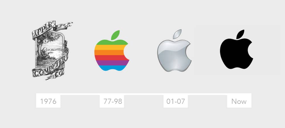
When Steve Jobs and Steve Wozniak founded Apple Computer Co. in 1976, their first logo was designed by co-founder Ron Wayne. It depicted Sir Isaac Newton sitting beneath an apple tree - a nod to discovery, ideas, and the moment of insight that changes everything. The company name was wrapped around the border in ornate ribbon text.
On paper, it ticked a lot of boxes. It connected the brand to one of history's greatest scientific minds. It told a story. It explained the name. But it had a fundamental problem that would become obvious very quickly: it was far too complex to work as a brand mark.
The illustration was intricate, hard to reproduce at small sizes, and impossible to use across different media. In 1977 - barely a year later - Jobs commissioned Rob Janoff to design something new. The result was the rainbow-striped apple with a bite taken out of it. That single design decision changed the trajectory of the brand entirely.
Why simplicity won
The rainbow Apple logo lasted from 1977 to 1998. It was bold, distinctive, and immediately recognisable. But as Apple moved into new product categories and digital platforms, even the rainbow stripes started to feel like unnecessary complexity.
In 1998, the logo shifted to a monochrome silhouette. No colour. No gradients. Just the shape. And it's barely changed since.
That's not a coincidence. The most effective brand marks in the world share a common trait: they work at any size, on any surface, in any context. A logo that depends on colour or detail to be recognised is a logo that will eventually need redesigning. Apple's silhouette works embossed on aluminium, printed on a receipt, displayed at 16 pixels on a browser tab, or projected across a 60-foot stage. The shape does all the work.
Apple didn't just follow this trend. They were one of the companies that established it. The lesson is straightforward: as brand recognition grows, the logo can afford to say less. The audience fills in the rest.
Brand awareness changes what a logo needs to do
When Apple was a small startup in a garage in Los Altos, the logo needed to explain who they were. Newton under the tree was trying to communicate: we're thinkers, we're inventors, we make things happen. That made sense when nobody had heard of the company.
By the time the rainbow logo was introduced, Apple was already gaining recognition. The logo didn't need to explain the company anymore - it needed to be memorable. The rainbow stripes made the mark distinctive in an era when most tech companies used plain text or abstract geometric shapes.
By 1998, Apple was a household name. The logo's job shifted again. It no longer needed to be distinctive - it already was. Now it needed to be versatile. It needed to work on the back of an iMac, on a software icon, on packaging, on a retail storefront. Monochrome achieved that.
This progression applies to every business, not just global technology companies. If your brand has built recognition in your market, your logo might be working harder than it needs to. That's worth evaluating.
Apple's influence on modern design
Apple hasn't just refined its own branding over the decades. It's fundamentally shaped how the rest of the industry thinks about design.
Visit apple.com and you'll see a masterclass in restraint. Huge amounts of whitespace. Minimal navigation. Typography doing the heavy lifting. Product images that dominate without competing with surrounding elements. Every pixel is deliberate, and nothing is there by accident.
This approach - often called minimal design - has become the default for serious brands across every sector. But Apple was doing it before most of the design community had caught up. Their product design philosophy of removing everything that isn't essential translated directly into their digital presence, their packaging, their retail spaces, and their advertising.
The ripple effect has been enormous. When Apple proved that simplicity could be a premium signal rather than a budget constraint, it changed the conversation entirely. Design trends like flat design, content-first layouts, and typographic hierarchy all trace back, in part, to Apple's influence.
The web 2.0 lesson
If you were working in or around digital design in the mid-2000s, you'll remember the web 2.0 era. Glossy buttons. Drop shadows on everything. Colour gradients, embossed text, reflective surfaces, and faux-3D effects on every element that would stay still long enough.
It was exciting at first. Design tools had become powerful enough to create these effects easily, and the temptation to use every available option was strong. But it aged badly, and it aged fast. Within a few years, sites that had been considered cutting-edge looked cluttered and dated.
The brands that weathered that era best were the ones that had already committed to simplicity. Apple's logo didn't need updating when flat design became the standard, because it was already flat. Brands that had built glossy, effect-heavy logos had to redesign entirely.
Skype is a good example. Their original logo was loaded with web 2.0 effects - glossy finish, heavy drop shadow, rounded bubble styling. Over time, they stripped it all back to a clean, flat wordmark. The brand became clearer the moment the decoration was removed.
Future-proofing your brand
One of the most practical takeaways from Apple's branding evolution is this: the simpler your brand mark, the longer it lasts.
Design trends come and go. What looks contemporary today will look dated in five years. A logo built around the current trend - whether that's gradients, 3D renders, or AI-generated complexity - will need updating the moment that trend passes. A simple, well-crafted mark can outlast decades of trend cycles without looking out of place.
Test at every size
Your logo needs to work at 16px (browser favicon) and on a building fascia. If it loses legibility at small sizes, it's too complex.
Work in monochrome first
If your logo only works in full colour, it will fail on faxes, embossing, single-colour print, and dark mode interfaces. Design in black and white first, then add colour.
Remove until it breaks
Take elements away one at a time. If the mark still communicates your brand without a particular element, that element wasn't earning its place.
Separate the logo from the name
Your brand mark and your wordmark should be able to work independently. As recognition grows, the symbol alone should be enough.
Avoid trend-dependent styling
Glossy finishes, heavy gradients, and effect-driven styling will date your brand. Flat, clean, geometric marks survive trend cycles intact.
What this means for your business
Your business doesn't need to be the size of Apple for these principles to apply. Whether you're a local company or a national organisation, the fundamentals of effective branding are the same: clarity, consistency, and simplicity.
If your logo relies on effects that were popular five years ago, if it doesn't reproduce cleanly at small sizes, or if people can't sketch it from memory - it might be time to refine it. Not necessarily a complete rebrand. Sometimes the most powerful change is removing what doesn't need to be there.
Apple started with an illustration that told a story. They ended up with a silhouette that doesn't need one. That progression took decades, but the direction was always the same: simpler, cleaner, more versatile. That's the direction that works.