
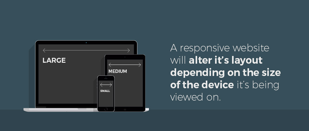
A responsive website is built using techniques that allow it to adapt and alter its layout, thus accommodating for the screen size of the end user without sacrificing content or accessibility. If somebody views a responsive website on their smartphone, they’ll see the same website as somebody using a desktop computer, the only difference is that they will see a layout best suited to their screen size. A well thought out responsive website will give users on many different platforms a great overall user experience, and could even have a positive effect on user retention and sales.
A little old laptop sits patiently in a cupboard, it’s ready to go at any given moment to show you a world of possibilities – to take you from website to website as you can search, browse, and order those overpriced cinema tickets for the latest Marvel film. That little laptop has been sat in the dark for a while now hasn’t it? It’s probably been sitting there for weeks, maybe even months, and all the while its been gathering dust. But you don’t care! You’ve got your smart phone, and you’re tapping away on that little screen like your fingers are on fire, sharing cat videos, looking up cake recipes and even occasionally making a purchase on Amazon.
Chances are, you spend more time browsing the internet on your smart phone than you ever did on that laptop, and why shouldn’t you? You have a plethora of information available at your finger tips whenever and wherever you want it, it’s there and you praise the internet for all it has delivered. That’s until you visit a site that isn’t responsive. When this happens the whole experience gets a bit, well, awful. You’re now browsing a full blown desktop website through a small screen; the equivalent of watching Jurassic Park on a stamp sized television. As you awkwardly fumble around this monstrous web page you suddenly realise that you have to pinch to zoom, and/or scroll back and forth horizontally to see the content.
You can’t find the information you need, and the text is so small that your head aches when you try to read it. This is what we call a bad user experience. After all, as a user, how long would it take you to give up in frustration and jump to another website?
Smartphones now overtake laptops when it comes to UK internet users.
If your site isn’t mobile friendly, you could be selling yourself short and cutting out an entire demographic of people who primarily browse websites on their phones. When the potential sale of a product or service you’re offering relies on whether the user can view your website on a phone can be a scary thought. If something as simple as this can have a negative impact on your conversation rates, you need to rethink your online strategy.
What are the main benefits to having a responsive website?
Here’s a quick breakdown of some of the benefits of having a responsive website;
A better user experience
Having a site optimised to dynamically change it’s layout will allow many users on many different devices to see your website.
A longer shelf life
Websites get old and tired, just like everything else. But a responsive website will be future proof for new devices that arrive on the market.
It’s more professional
By keeping up with the latest web tech, you’re showing your users that you mean business and you’re serious about your online presence
Give us a call
If you have any further questions about responsive websites, or you’d like to pop in for a coffee to discuss your own website, please drop us a line on 01423 603 123.